Objective
The objective of this project was to redesign the MyJio (Jio's app) mobile dashboard experience to address common pain points and enhance the overall user journey.
Improve the overall UI and visual appeal to reduce cognitive load and elevate brand perception.
Enable users to quickly repeat previous purchases while encouraging exploration of additional plans.
Notify users of upcoming plan expirations with visually engaging reminders.
Increase user engagement, retention, and conversion through an intuitive and user-centered design.
Problems identified
Due to tight timelines and the organizational structure, we couldn’t conduct new user interviews. However, I collaborated with the product team to gather insights from their prior visits to Jio stores and discussions with the customer service desk. These key insights informed our design decisions:
Understanding the user is key
Feedback from Jio store visits highlighted that the app’s design made it difficult for users to focus on key information due to visual clutter and poor hierarchy.
Limited repeat purchase options
Customers expressed frustration about the lack of a straightforward way to quickly repeat their previous recharge plans without having to search through the options again.
Missed opportunities for personalization
Despite having rich data on user behavior, there was limited use of personalized content to highlight relevant plans, services, or reminders that could add value to the user experience.
Data tracking challenges
Analytics revealed that users frequently recharged for additional data while their current plan was still active. However, the multistep process to do so was inconvenient.


Opportunity
Based on the insights gathered, several opportunities were identified to improve the app experience and address user challenges.
How might we
Reduce confusion and increase trust by presenting clear, visually engaging information about active plans, bills, and usage.
Help users manage their accounts better by delivering timely and relevant reminders.
Simplify plan renewal by providing personalized recommendations based on user behavior and preferences.
Enable users to quickly purchase more data reducing the efforts when their existing data is running low or exhausted.
Explorations
To create a seamless and intuitive experience for users on the home screen, we explored three distinct design architectures, each focusing on presenting key information and actions in unique ways.
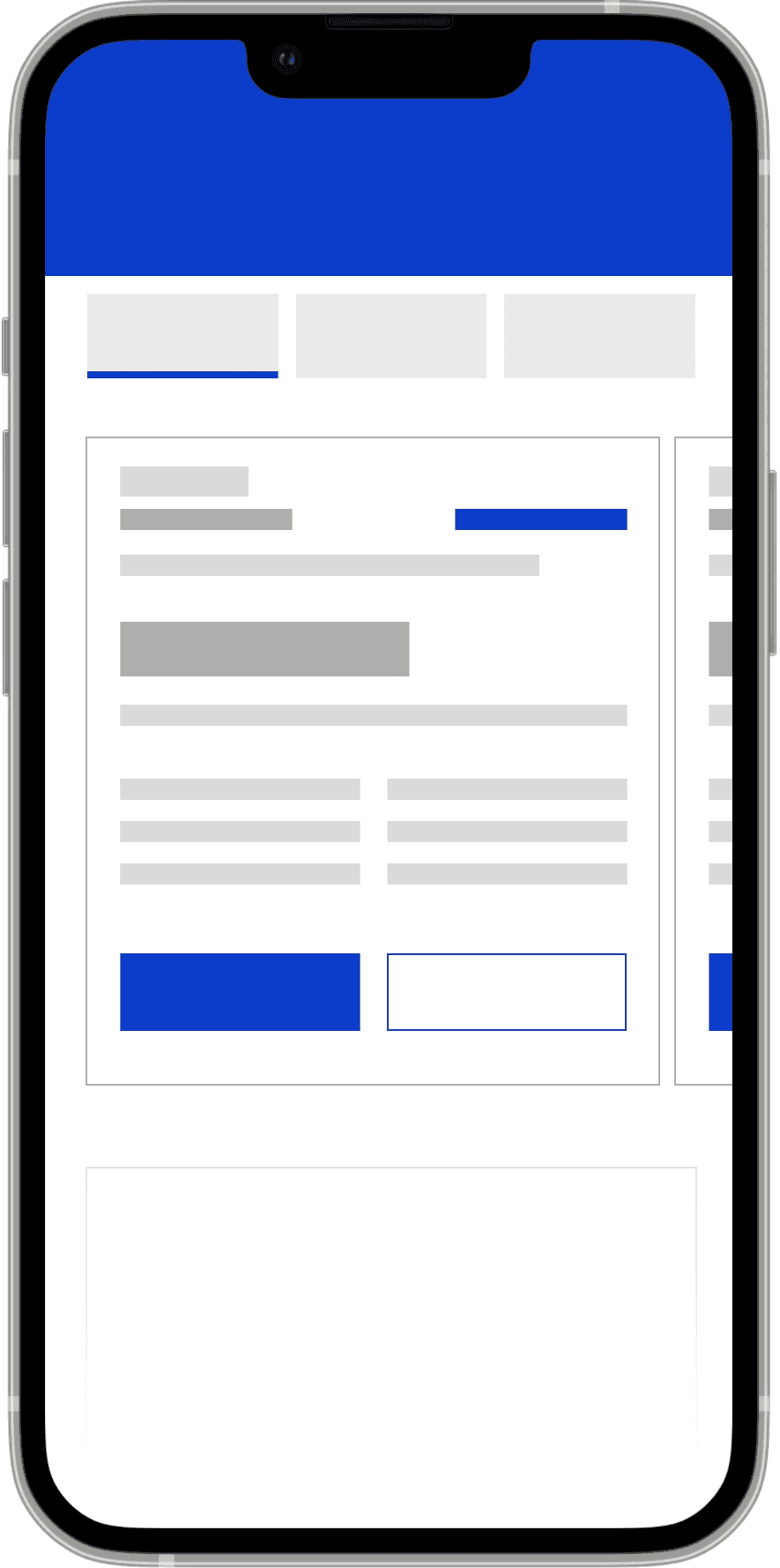
Single card layout
This approach combined all critical information—data usage, current plan details, and recharge options—into a single card occupying the main screen.
Everything is visible in one place
Limited scalability for adding new features or sections.
Risk of overcrowding the card with too much information, leading to cognitive overload.

Tabbed navigation
This layout split the home screen into tabs like "Data Usage," "Plans," and "Recharge." Users could navigate between sections using a top tab bar.
Reduces information density on a single screen.
Increases effort to switch between tabs for users who want an overview.
Critical actions like quick recharges may not be immediately visible.
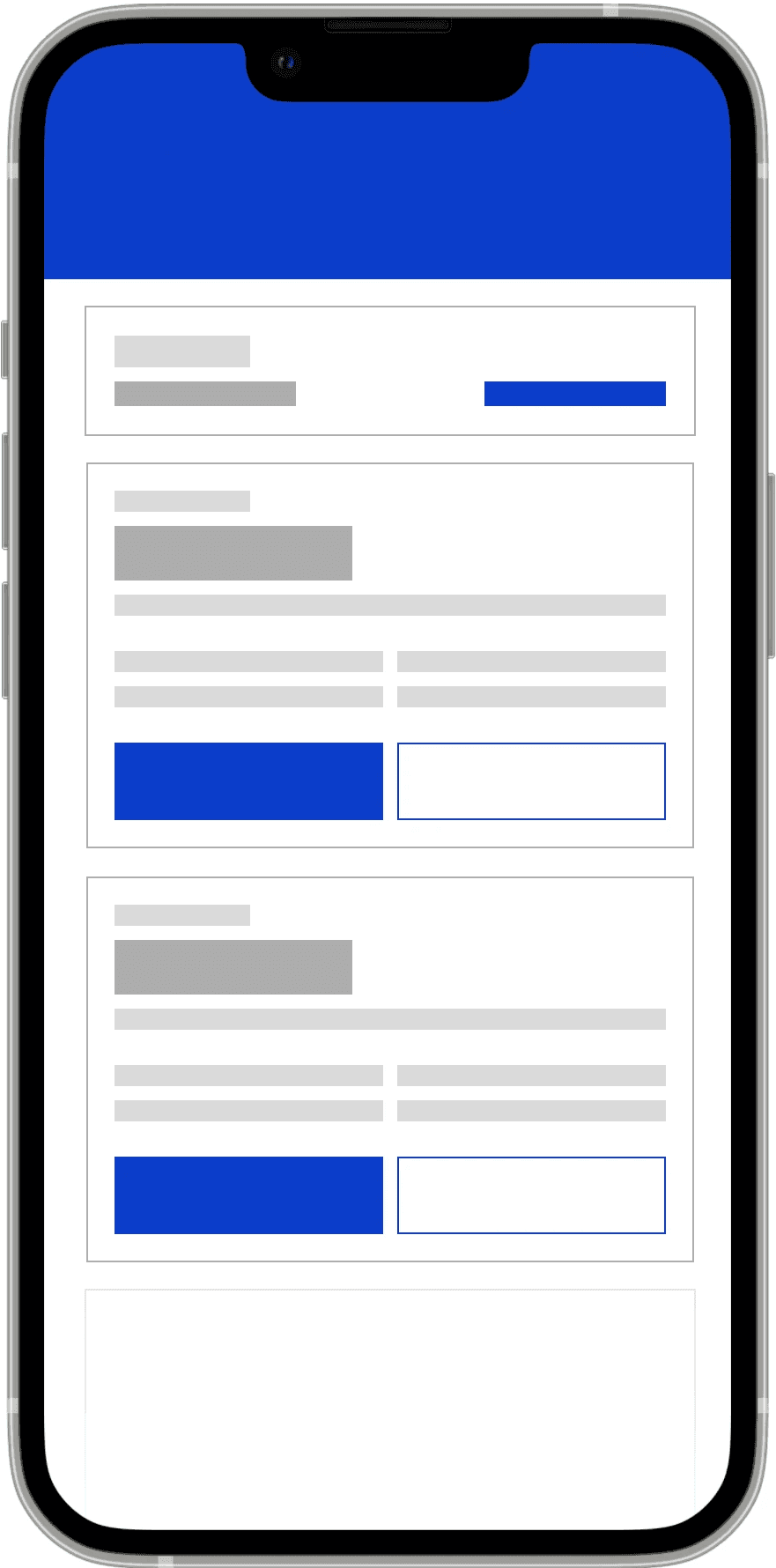
Multiple cards layout
In this approach, the home screen used separate cards for data usage and plan details, creating a modular and scalable structure. Recharge options and key actions were integrated into the relevant sections.
Makes it easy to add or update features in the future without redesigning the structure.
Improves clarity by separating related information into distinct sections.
Allows users to focus on specific details like data or plans without distraction.
Requires an effective visual hierarchy to avoid clutter with multiple cards.
Solution
A new look
The redesigned home screen enhances usability and visual clarity by separating data and plan summaries, catering to their distinct use cases. This approach allows users to easily track real-time data usage and manage long-term plan details independently, while providing quick access to essential actions for a seamless telecom experience.
Use cases
Prepaid user
Information clarity
The data balance section includes a progress bar to help users quickly understand remaining data.
The upcoming plan section highlights queued plans, reassuring users that the recharges done before the current plan expires is queued up.
Prepaid user
Actionable alerts and upselling
A warning label notifies users of an expiring plan, while recommended plans highlight the previous choice for easy renewal and promote upselling for quick decisions.
Prepaid user
Personalized user experience
The low data scenario uses a red "Low Data" tag and progress bar to create urgency, prompting quick action.
Personalized data booster recommendations offer tailored solutions, streamlining decision-making and enabling fast purchases while ensuring a clean, actionable design.
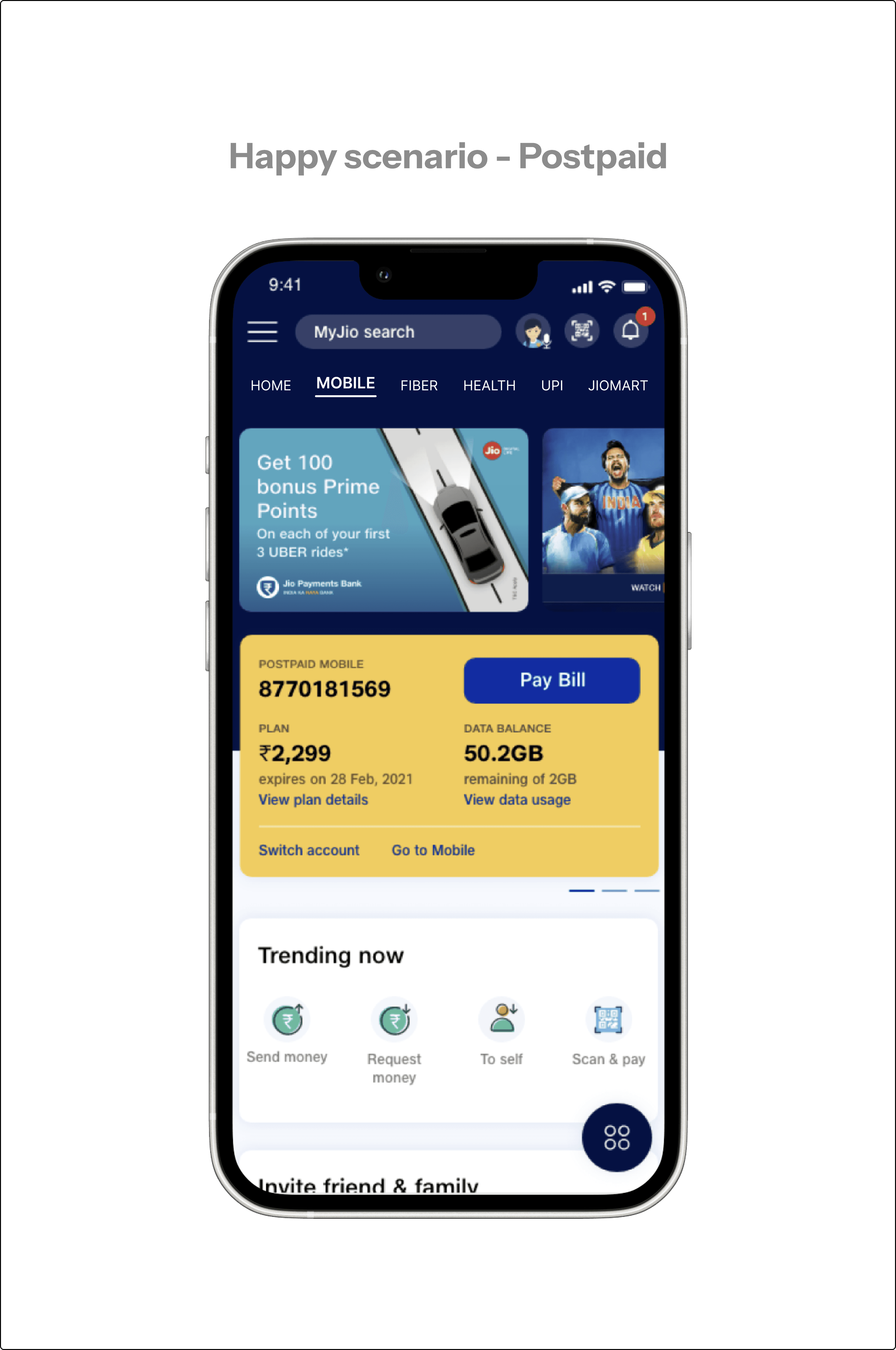
Postpaid user
Visual hierarchy and contextual design
This design follows the principle of hierarchy, prioritizing the urgent task of bill payment.
This design uses contextual design by prioritizing the "Pay Now" button when a bill is due, ensuring users can focus on urgent tasks while minimizing distractions.
All users
Feedback
By showing a loading indicator and the text we we acknowledge the user's action and reduce uncertainty. The animation helps:
Enhance trust by demonstrating that the system is actively working.
Prevent users from feeling confused or assuming the app is unresponsive.
Non Jio user
Status visibility
For non-Jio users who have initiated the porting process, this section displays the progress of their mobile number port-in. It provides clarity and keeps users informed about the status of their transition to Jio's network.

Key metrics
Based on the insights gathered, several opportunities were identified to improve the app experience and address user challenges.
~15%
increase in plan renewal rates due to timely warnings and easy access to recommended plans.
~20%
drop in customer support queries related to billing and plan renewals, freeing up resources.
Result and Impact
Based on the insights gathered, several opportunities were identified to improve the app experience and address user challenges.
Improved visual hierarchy helping users quickly locate and act on critical information.
Clear notifications ensured users stayed informed about plan expirations and updates.
Modern design language and consistent visuals enhanced the app’s aesthetics and brand perception.
What I learned?
Understanding the user is key
Research revealed that visual noise and poor navigation were the biggest roadblocks, not the features themselves.
The power of iteration
Iterative design allowed me to test assumptions, validate solutions, and refine the experience for real-world use cases.
Collaboration drives results
Working closely with developers and product managers ensured a balance between business goals and user needs.