The spark
Success targets
Goal
KPI
Why it mattered
Easy first edit |
≤ 3 taps from upload to result
Reduces user drop-off at onboarding
Viral potential |
≥ 70 % of “playful” users tap Share
Supports client’s growth pitch
Maintain privacy |
Share sheet toggle to hide original image
Addresses legal & brand concerns
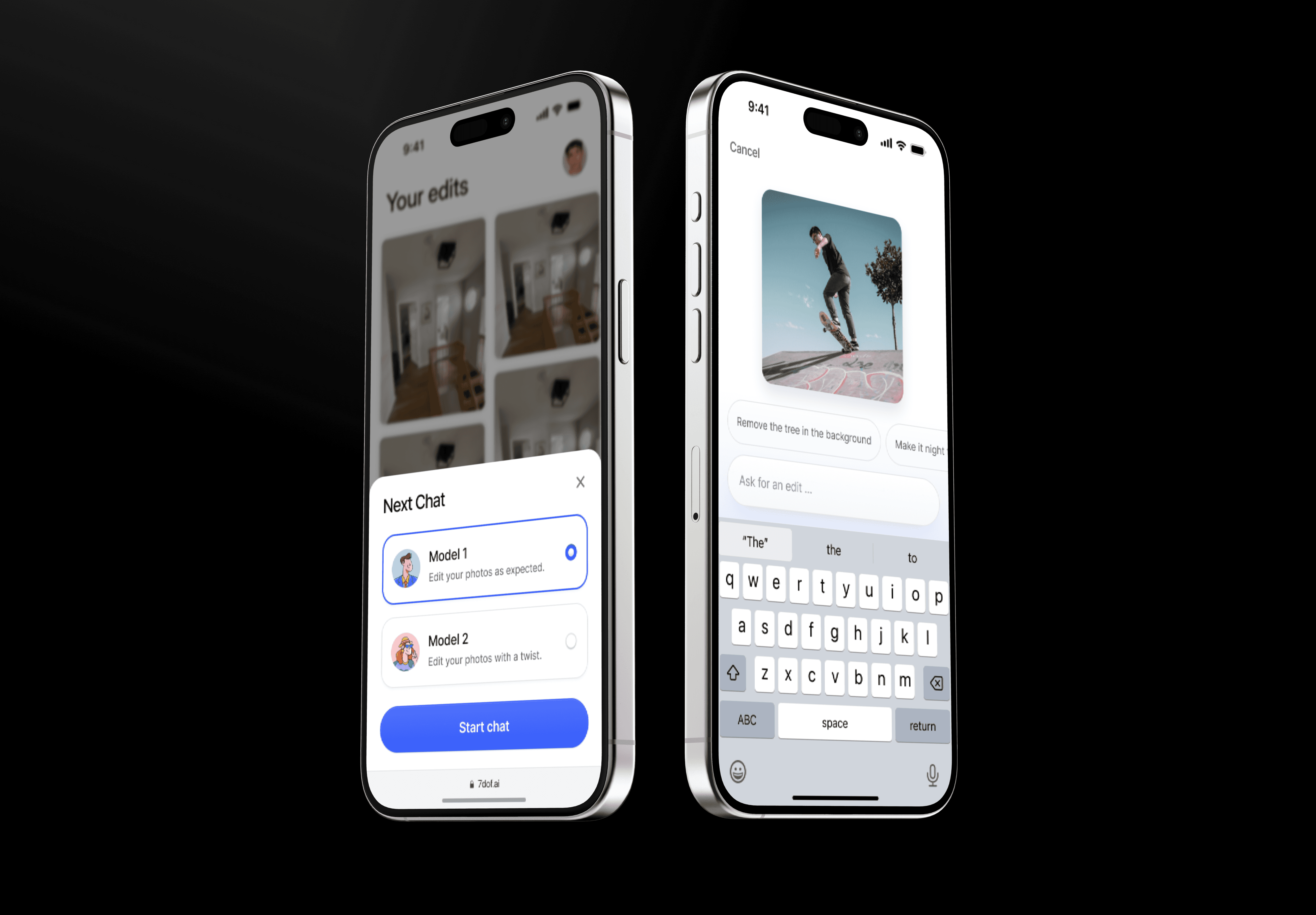
Dual mode
Mode
Purpose
UI signal
Model 1 – ‘Edit as expected’ |
Reliable, professional retouching
Clean white canvas, subtle blue accents
Model 2 – ‘Paw mode’ |
Humorous, sarcastic twists for social virality
Lavender gradient backdrop + playful avatar
Constraints & how I handled them
Constraint
Tactic
Solo designer, tight deadline
Re-used an atomic component library; daily design/dev checkpoints
No budget for formal research
Mined editing-tool forums for pain points; ran 5 hallway tests with the client’s staff
Two very different “personalities”
Model-picker bottom sheet makes the choice explicit before work begins
Process highlights
Competitive scan - Canva, Adobe Express, Photoleap
User-flow sketches - serious vs. playful paths on one canvas.
Wireframes → hi-fi in 48 h using Figma variants and tokens.
Rapid usability loop - two rounds with 5 testers from the client team.
Visual polish & microcopy - single type scale, WCAG-safe colours.
Key screens & design choices
Step #1
Model picker
Why it matters - Users instantly grasp the “two personalities” concept; hallway tests showed a 98 % correct selection on first try.
Micro copy - “Edit your photos as expected” vs. “with a twist” sets tone without jargon.
Step #2
Upload & prompt
Dashed-border drop zone signals actionability.
Context chips drive 63 % of first prompts (reducing cold-start anxiety)
Loading state
Real-time feedback
Gradient blurry placeholder indicates processing without implying failure.
Step #3 (optional)
Editor
Tap to expand image → tool ribbon slides down.
Brush-pointer icon = selective edit; state changes to ‘Edit selection’ chip so users know they’re scoped.
Undo/redo persist top-bar for muscle memory.
Outcomes
Metric (pilot users = 5)
Target
Result
First edit completed |
≤ 3 taps
2.2 taps
Paw-mode share click |
≥ 70 %
4 / 5 users (80 %)
“Would use again” survey |
-
100%
SUS score |
≥ 80
86
Impact & next steps (hand-off)
The prototype met all success targets and was shown in the client’s seed-fund pitch deck.
Next up: voice prompts, dark-mode polish, WCAG contrast tweaks, and a content filter for NSFW requests.
Reflection
Working as the sole designer on a two-week freelance brief reinforced three lessons:
Front-load choice - giving users the model picker first removed later confusion.
Seed actions - prompt chips cut time-to-first-edit by more than half.
Stay in one screen - inline editing simplified the build and felt faster to users.